Emoto, an experimental typeface
Emoto is an experimental typeface that explores the evolution of our written language from a long-form, alphabetic structure to an increasingly pictorial, image-based experience.
Typographic form solicits empathy: the reader picks up on a subtle emotional undercurrent, and approaches and understands the story accordingly. In digital spaces, however, the typefaces we encounter reflect the operating system of our device or the reading platform itself, rather than the content. Additionally, most reading in the digital space comes in the form of short, truncated bites, rather than longer narratives—the arcs of which provide valuable context.
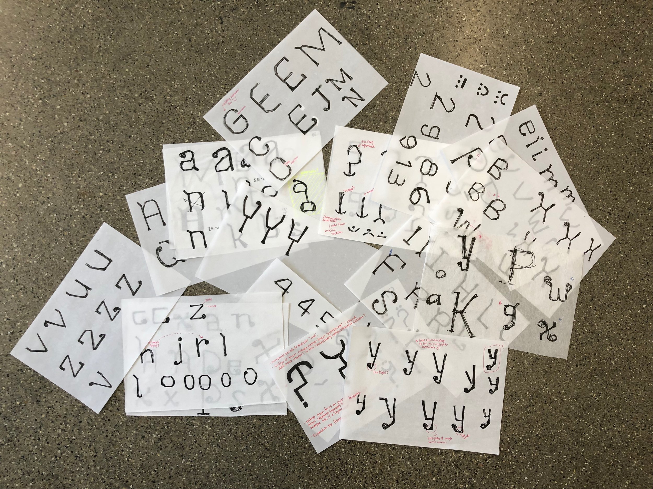
By developing a new system of punctuation marks, and encoding Emoto so it morphs language output as the user types, my typeface streamlines inflection, empathy, and emotion within our modern written language. Emoto answers questions such as: How do we decode emotive inflection in short bites of modern writing? How do devices like Siri and Google Home decode emotive inflection? If emoji visually concretize emotion, and letterforms visually concretize sound, can the two combine to accomplish both goals in more fluid and accessible marks?
Emoto was developed over the Summer of 2018 through a 6-week Guestship intensive with Rod Cavazos, a leader within the type design field and founder of the San Francisco-based type foundry, PSY/OPS. The Guestship included weekly one-on-one meetings with Cavazos and his staff during which they assessed my design work and provided technical expertise. Spending time in their studio and observing first-hand the business of running a foundry, as well as the process of working through client-commissioned work, proved invaluable. During this same time period, I served as visiting designer at California College of the Art’s Type Design Studio course, taught by Cavazos.


